|
|
|
|
|
A Sample Project - Page 3
|
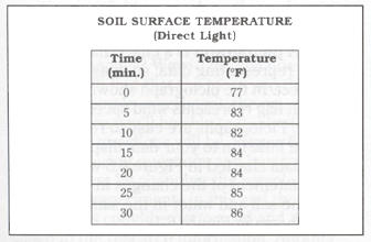
Figure 6.6 Example of a Table |
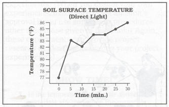
Figure 6.8 Examples of a Line Graph |
|
RESULTS
|
Figures
6.6 through 6.8 give examples of three different ways to express the same
data for surface temperature of soil. Figure 6.6 shows another example
of a table, Figure 6.7 shows a bar graph, and Figure 6.8 shows a line
graph (a diagram that uses lines to express patterns of change).
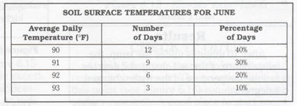
There are other useful ways to represent data. A circle graph, or pie chart, is a chart (data or other information in the form of a table, graph, or list) that shows information in percentages. The larger the section of the circle, the greater the percentage represented. The whole circle represents 100 percent, or the total amount. For example, a pie chart can be used to represent the results of an experiment measuring soil surface temperatures for June. To make a pie chart, first record the number and percentage of days that have each average daily temperature in a table, as shown in Figure 6.9. Then, express the same data as percentages in a pie chart, as shown in Figure 6.10. Note that illustrations of children are placed around the circle to add interest to the data display. |
|
Figure 6.9 Table of Soil Subsurface Temperature |
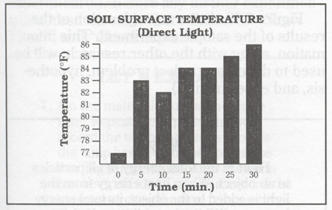 Figure
6.7 Example of a Bar Graph
Figure
6.7 Example of a Bar Graph